Migrating extensions from Umbraco 13 to 17

The first beta of Umbraco 17 is just around the corner 🎉
This is the next Long Term Supported (LTS) version, which makes it a quite exciting release for many of us.
The release is probably also somewhat unnerving to some - particularly the ones about to migrate older sites with custom backoffice extensions.
What’s the big deal with Umbraco 17?
If you’ve been out of the Umbraco loop for a couple of years, here’s the gist: Starting with Umbraco 14, the entire backoffice has been rewritten from the ground up.
The current LTS version is Umbraco 13, which was released in December 2023. The Umbraco 13 backoffice is built with AngularJS.
In Umbraco 17, AngularJS is gone. The backoffice is now powered by modern and native web technologies, most predominantly Web Components 💪
This means custom backoffice extensions will have to be rewritten to some degree, particularly if they’re not written using Web Components from the get-go.
Do I have to rewrite my extensions, then?
Well. That depends.
This shift in backoffice technology naturally requires a shift in skills for those implementing backoffice extensions. The official documentation contains great tutorials to guide you, and the Umbraco community has also been busy sharing their experiences in blogs and articles over the past few years.
However… if you’re not quite ready to adopt TypeScript, Vite and everything else modern web development has to offer, you don’t have to 👍
In my experience, a lot of custom backoffice extensions for Umbraco 13 are based on a simplistic setup. They utilize package manifests to load views, scripts and styles from source files in the App_Plugins directory straight into the backoffice.
This is still entirely possible in the later versions of Umbraco, without rewriting everything from scratch. It just requires a bit of repackaging 🎁
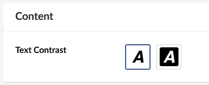
An Umbraco 13 property editor
To demonstrate the repackaging process, I have built a text contrast picker editor for Umbraco 13. It looks like this:
Here are the source files, which are all stored under /App_Plugins/My.TextContrastPicker/.
package.manifest
{
  "name": "My Text Contrast Picker",
  "version": "1.0.0",
  "propertyEditors": [{
      "alias": "My.TextContrastPicker",
      "name": "Text Contrast Picker",
      "icon": "icon-font",
      "group": "Custom",
      "editor": {
        "view": "~/App_Plugins/My.TextContrastPicker/view.html",
        "hideLabel": false,
        "valueType": "STRING"
      }
    }
  ],
  "javascript": [
    "/App_Plugins/My.TextContrastPicker/controller.js"
  ],
  "css": [
    "/App_Plugins/My.TextContrastPicker/styles.css"
  ]
}
view.html
<div ng-controller="My.TextContrastPicker.Controller">
  <button type="button" class="text-contrast-picker-item"
      ng-class="{'-selected': 'default' === model.value}"
      ng-click="setValue('default')">
	<umb-icon icon="icon-font color-black" class="icon"></umb-icon>
  </button>
  <button type="button" class="text-contrast-picker-item"
      ng-class="{'-selected': 'inverted' === model.value}"
      ng-click="setValue('inverted')">
	<span class="text-contrast-picker-item--black">
	  <umb-icon icon="icon-font" class="icon"></umb-icon>
	</span>
  </button>
</div>
controller.js
angular.module("umbraco").controller(
  "My.TextContrastPicker.Controller",
  function ($scope) {
    $scope.setValue = function(value) {
      $scope.model.value = value;
    }
  });
styles.css
.text-contrast-picker-item {
  background-color: white;
  border-radius: 3px;
  display: inline-flex;
  align-items: center;
  justify-content: center;
  width: 42px;
  height: 42px;
  transition: all .15s ease-in-out;
  cursor: pointer;
  margin-right: 5px;
  font-size: 24px;
}

.text-contrast-picker-item {
  border: 2px solid #e9e9eb;
}

.text-contrast-picker-item:hover {
  border: 2px dashed #2152a3;
}

.text-contrast-picker-item.-selected {
  border: 2px solid #2152a3 !important;
}

.text-contrast-picker-item--black {
  background-color: black;
  border: 4px solid black;
  display: flex;
  border-radius: 3px;
  color: white !important;
}
All of this should look familiar, if you’re building backoffice extensions for Umbraco 13.
Repackaging for Umbraco 14+
Repackaging the property editor for Umbraco 14+ requires two things:
- Rewriting the
package.manifestfile as anumbraco-package.jsonfile. - Wrapping the editor implementation in a Web Component.
In Umbraco 14+, the source files are also stored under /App_Plugins/My.TextContrastPicker/.
umbraco-package.json
For the purpose of repackaging an Umbraco 13 extension, umbraco-package.json can be considered the Umbraco 14+ equivalent of the package.manifest file.
The umbraco-package.json file looks like this:
{
  "name": "My.TextContrastPicker",
  "version": "1.0.0",
  "extensions": [{
      "type": "propertyEditorUi",
      "alias": "My.TextContrastPicker",
      "name": "Text Contrast Picker",
      "element": "/App_Plugins/My.TextContrastPicker/element.js",
      "meta": {
        "label": "Text Contrast Picker",
        "icon": "icon-font",
        "group": "Custom",
        "propertyEditorSchemaAlias": "Umbraco.Plain.String"
      }
    }
  ]
}
That’s not too strange looking, is it? In fact, it looks a lot like the package.manifest - but there are some key differences.
In umbraco-package.json, all backoffice extension types are registered in a single extensions collection.
A custom property editor is registered as an extension of type propertyEditorUi. This corresponds to adding entries in the propertyEditors collection of package.manifest.
The alias is the unique identifier of the extension. To ensure a smooth upgrade experience from Umbraco 13, make sure you use the property editor alias from package.manifest.
The name is a human-readable representation of the extension. It is mostly used for debugging and reporting purposes.
The element is the Web Component for the extension. Conceptually, this is equivalent to the extension assets (views, scripts and styles) in package.manifest. The Web Component is loaded straight into the backoffice from its source file in App_Plugins, just like the Umbraco 13 version.
Lastly, the meta object contains the specific configuration that applies to the propertyEditorUi extension type:
- The
labelis displayed in the backoffice for this property editor. It’s the equivalent of thenameinpackage.manifest. - The
iconandgroupserve the same purpose as in Umbraco 13. - The
propertyEditorSchemaAliasdetermines how the property value should be stored and rendered. This is equivalent to theeditor.valueTypeinpackage.manifest, at least to a point.
element.js
Where the Umbraco 13 backoffice was tightly coupled to AngularJS, the Umbraco 14+ backoffice is framework-agnostic. The only requirement is that extensions are implemented as Web Components.
Native Web Components can be rather tedious to write, specially once you factor in templating and reactivity towards editor inputs. That’s why Umbraco uses Lit to do some of the heavy lifting.
Here’s the Umbraco 14+ Web Component equivalent of the property editor:
import { UmbLitElement } from "@umbraco-cms/backoffice/lit-element";
import { UmbChangeEvent } from '@umbraco-cms/backoffice/event';
import { html, css } from "@umbraco-cms/backoffice/external/lit";

export class MyTextContrastPickerElement extends UmbLitElement {

  static properties = {
    value: { type: String }
  };

  setValue(value) {
    this.value = value;
    this.dispatchEvent(new UmbChangeEvent());
  }

  render() {
    return html`
<div>
  <button type="button"
    class="text-contrast-picker-item ${this.value === 'default' ? '-selected' : ''}"
    @click=${() => this.setValue('default')}>
    <uui-icon name="icon-font"></uui-icon>
  </button>
  <button type="button"
    class="text-contrast-picker-item ${this.value === 'inverted' ? '-selected' : ''}"
    @click=${() => this.setValue('inverted')}>
    <span class="text-contrast-picker-item--black">
      <uui-icon name="icon-font" style="color:white;"></uui-icon>
    </span>
  </button>
</div>
    `;
  }

  static styles = css`
    .text-contrast-picker-item {
      background-color: white;
      border-radius: 3px;
      display: inline-flex;
      align-items: center;
      justify-content: center;
      width: 42px;
      height: 42px;
      transition: all .15s ease-in-out;
      cursor: pointer;
      margin-right: 5px;
      font-size: 24px;
    }

    .text-contrast-picker-item {
      border: 2px solid #e9e9eb;
    }

    .text-contrast-picker-item:hover {
      border: 2px dashed #2152a3;
    }

    .text-contrast-picker-item.-selected {
      border: 2px solid #2152a3 !important;
    }

    .text-contrast-picker-item--black {
      background-color: black;
      display: flex;
      border-radius: 3px;
      color: white !important;
    }
  `;
}

customElements.define("my-text-contrast-picker", MyTextContrastPickerElement);

export { MyTextContrastPickerElement as element };
Again, that looks a lot like the Umbraco 13 implementation. As it should, because I’ve simply copied it over, wrapped it in an UmbLitElement and applied a few syntax changes 🚀
In fact, the only significant difference between the two implementations is how the property value is passed back and forth between the document and the property editor.
In Umbraco 13, this is all handled by the two-way binding of $scope.model.value.
In Umbraco 14+ there is no such two-way binding. Instead, the property editor Web Component is expected to:
- Declare a
valueproperty for the data binding. - Dispatch an
UmbChangeEventwhen the property value changes.
All in all, it’s not really that much work, and it’s certainly not a complete rewrite of the entire property editor ☺️
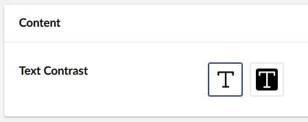
The end result looks pretty much like the starting point:
A few server-side considerations
This is all fine and well on the client-side, but if you’ve also built server-side implementations for your property editors, there might be a few more things for you to consider.
Property Value Converters
If you’re backing your property editors with your own Property Value Converter implementations, they may need a tiny update.
In Umbraco 13, the IsConverter() method is typically implemented by comparing the property editor alias against the EditorAlias of a property type - like this:
public bool IsConverter(IPublishedPropertyType propertyType)
  => propertyType.EditorAlias.Equals("My.TextContrastPicker");
In Umbraco 14+, the corresponding implementation should compare against the EditorUiAlias instead:
public bool IsConverter(IPublishedPropertyType propertyType)
  => propertyType.EditorUiAlias.Equals("My.TextContrastPicker");
That is - unless you also have your own Data Editor implementation. In that case, you’ll likely want to retain your existing implementation of IsConverter(), because it will be linked to the Data Editor 👇
Data Editors
A custom Data Editor is somewhat of a rarity for custom property editors, but there are cases when you’ll want to implement one.
If your property editor has a backing Data Editor, you should use its Alias as the propertyEditorSchemaAlias value in umbraco-package.json. For example:
[DataEditor("My.DataEditor.TextContrastPicker")]
public class MySuggestionsDataEditor : DataEditor
{
  ...
}
…should yield:
{
  "name": "My.TextContrastPicker",
  "version": "1.0.0",
  "extensions": [{
      ...
      "meta": {
        ...
        "propertyEditorSchemaAlias": "My.DataEditor.TextContrastPicker"
      }
    }
  ]
}
Parting remarks
I hope this post has helped ease your mind a little, if you’re somewhat weary about the prospect of migrating custom backoffice extensions to Umbraco 17.
The Umbraco 14+ backoffice is not just a shift in technology. It’s’ a shift in architecture, and a huge leap forward - both for the product and for those extending it.
The approach I’ve outlined here would by no means be considered best practice. But… If you’re in a pinch, and if your extensions aren’t too complex, it might just be a feasible path forward. At least as a temporary solution 🩹
It’s almost guaranteed to feel inconvenient when someone moves your cheese. Still… If you’re serious about extending the backoffice, I highly recommend you look at and learn from the resources available, be it tutorials or open source packages, to familiarize yourself with better practices than I have shown in this post.
Happy migrating 💜